Dashboard 2
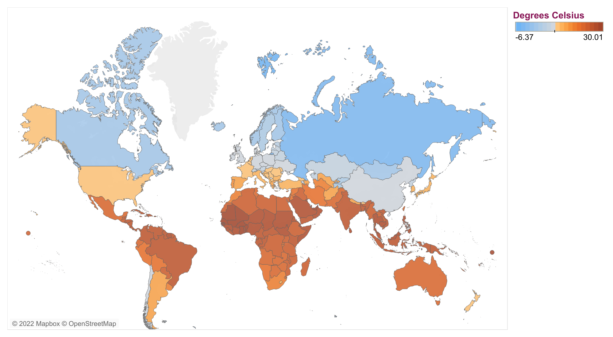
Source: Climate Knowledge Portal – World Bank, and CER calculations.
Description: This map shows average temperatures by country for 2021. The countries in blue are on average colder, while the countries in orange are on average warmer. To see an animated version of this graph, click here.

Be the first to comment